It took nearly three months to write and design the brand standards manual for Embry-Riddle Aeronautical University. At one point it was up to nearly 96 pages but after some judicious editing the client and I got it down to a mere 84. The manual was planned for both print—at landscape letterhead size—and as an interactive PDF. Clicking on the colored navigation at the top of the page jumped the reader to the first page of that section. The Table of Contents also provided click-through navigation. Below are just a few sample pages...
After many rounds of logo designs the client opted to go with a logotype that —while new—still had enough similarities with their old mark that it would not be a radical departure. One of the ideas incorporated into the design was to rid the name of the hyphen in favor of an extension of the crossbar of the letter "R". This moves the two names closer together giving a greater sense of unity. Glenn Bowman designed the final art based upon his original concept. There is a new brand standard at ERAU so do not use any of this material as it is out-of-date.
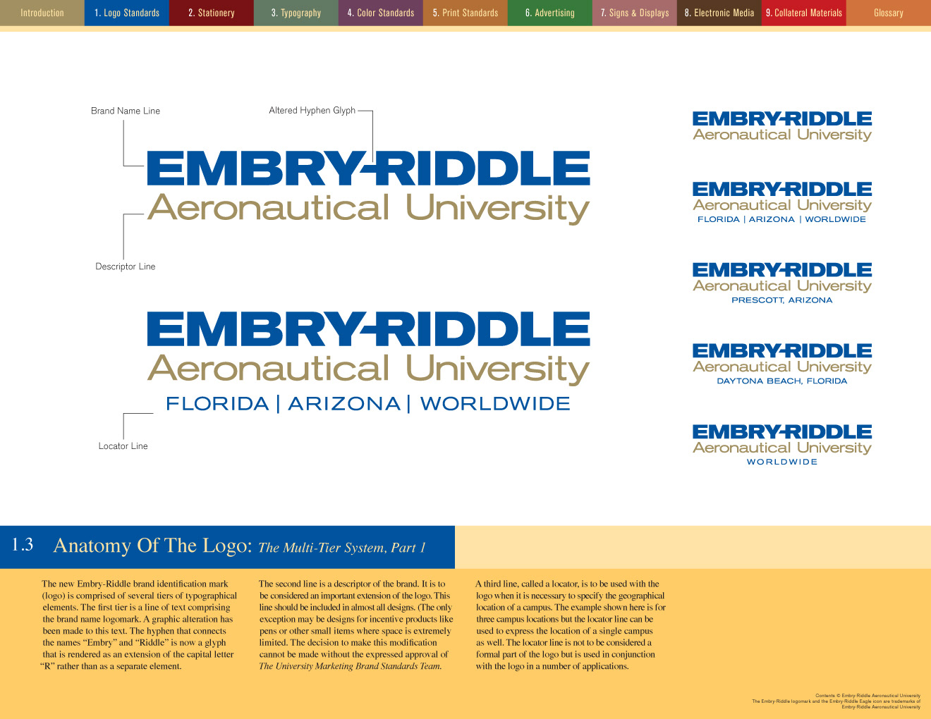
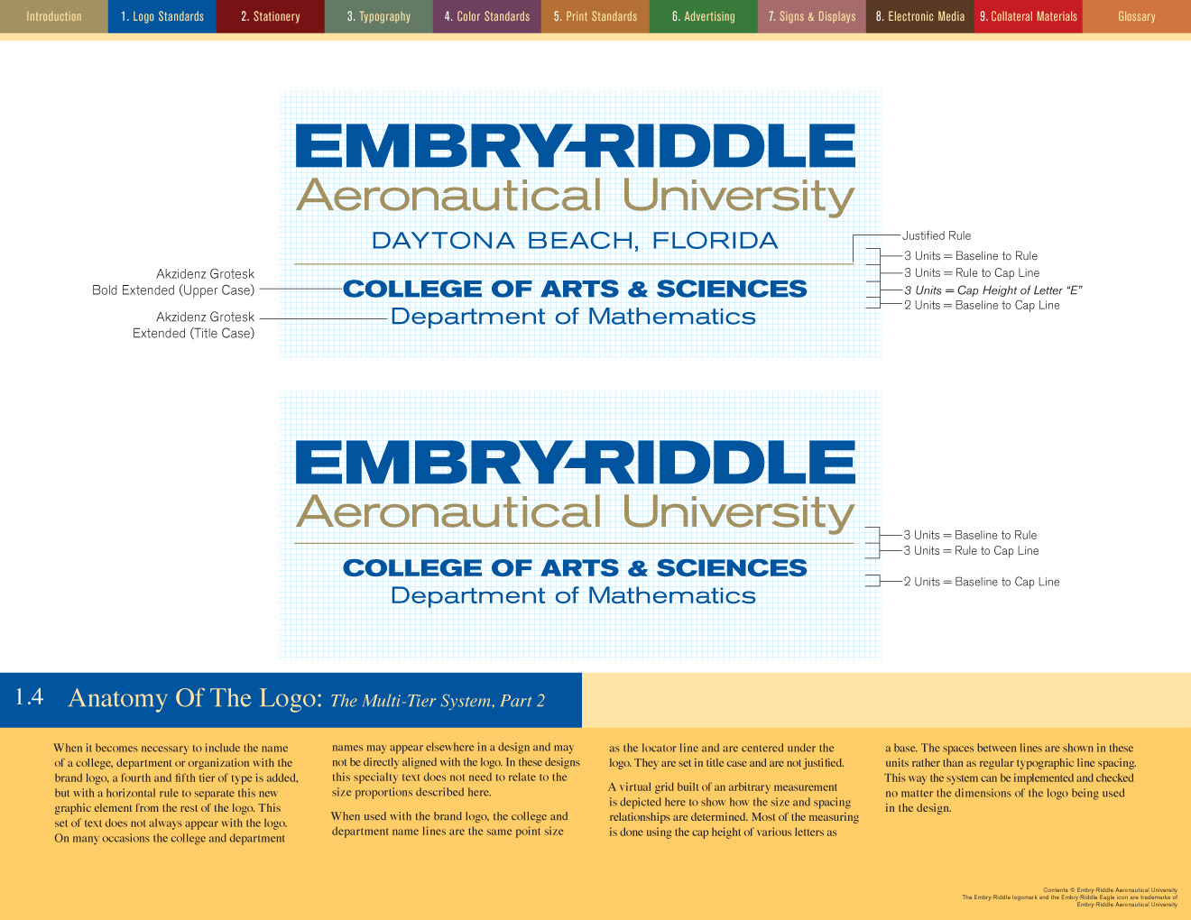
While writing and designing a brand standards manual I had to constantly remind myself that a number of non-designers would be using it. That meant that nearly everything had to be explained in great detail and with measurements that made sense to the reader that were less intuitive. You cannot simply say, "Looks good to me." Everything has a reason...
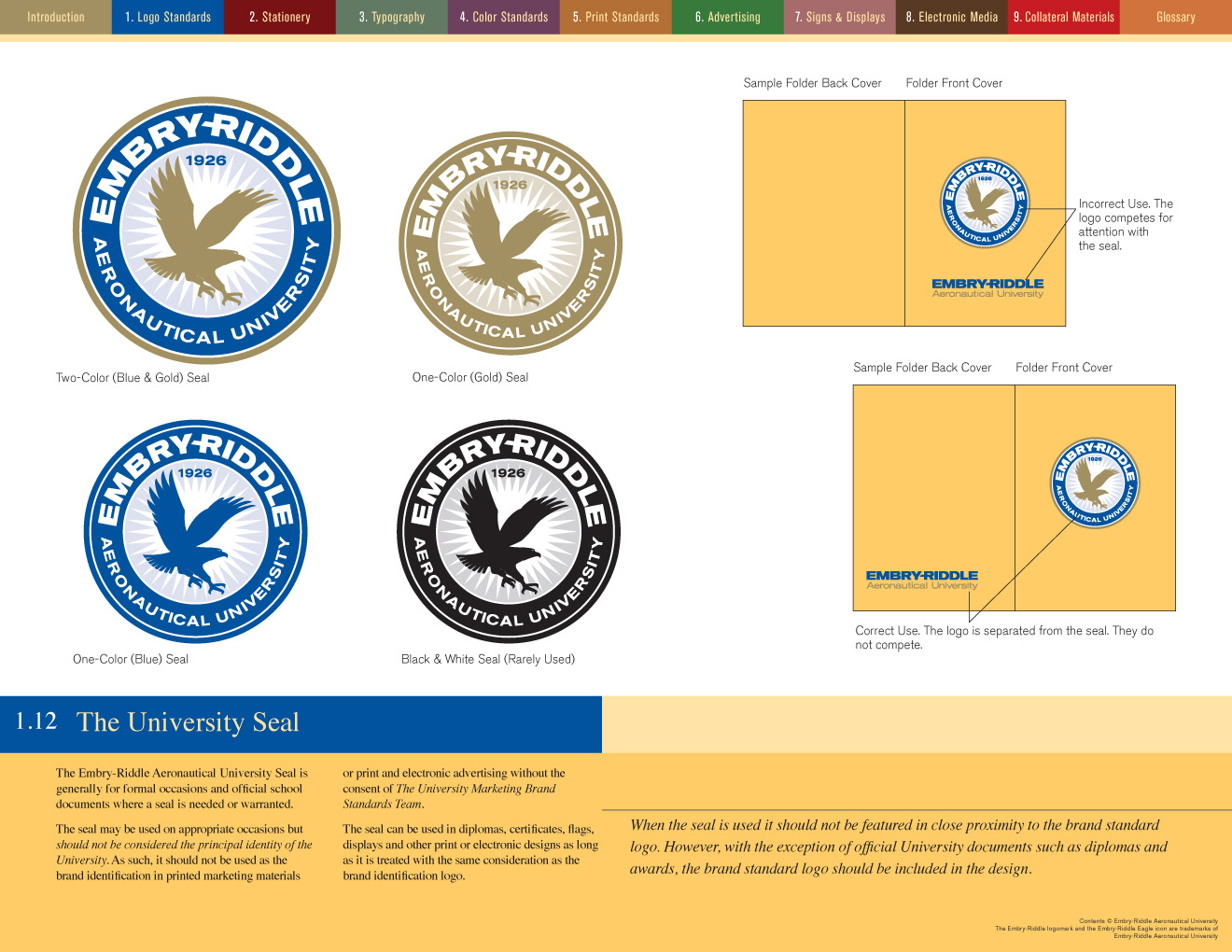
The logo originally featured an eagle that looked more like a badly rendered griffin. Although the eagle was dropped from the main brand identity, it was still to be used on the official seal and as a graphic element on items like jackets and shirts. I designed the new eagle (shown above) as a strictly a silhouette, but one with attitude as well as altitude. See the current brand standard at ERAU.
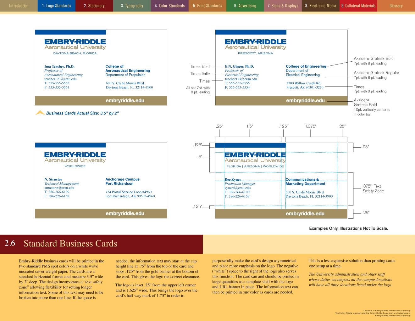
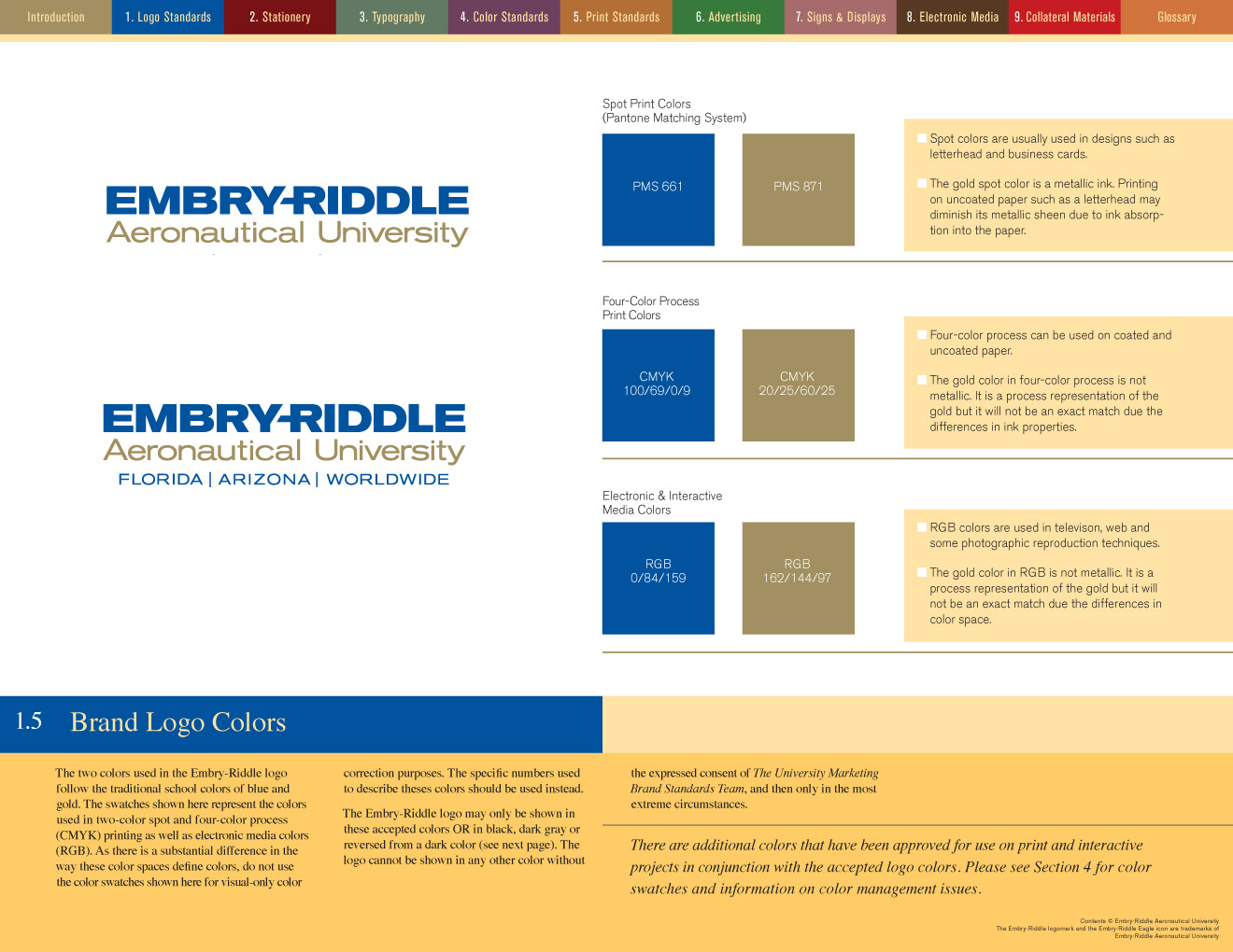
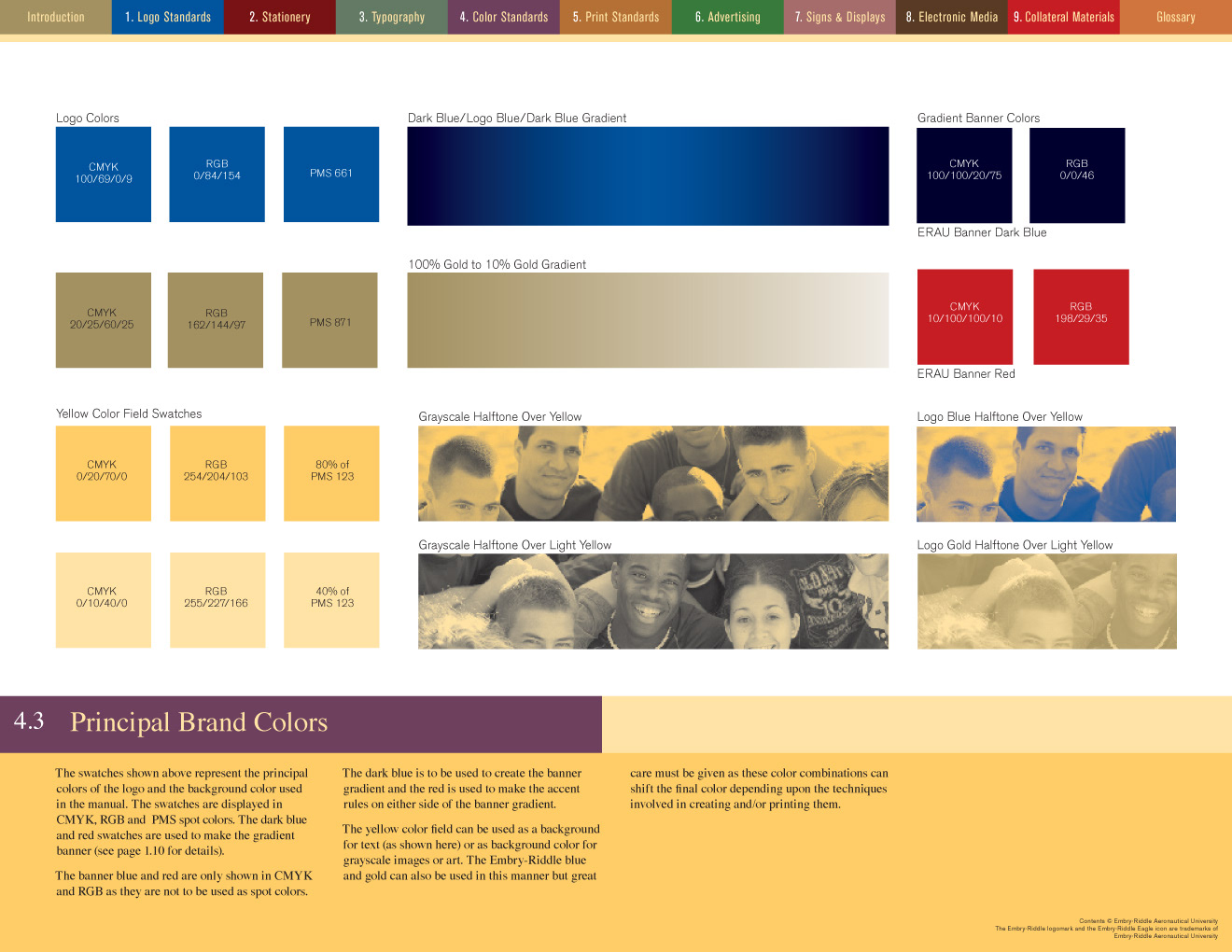
Letterhead and business cards are comprised of two spot colors, one of which is a metallic gold.
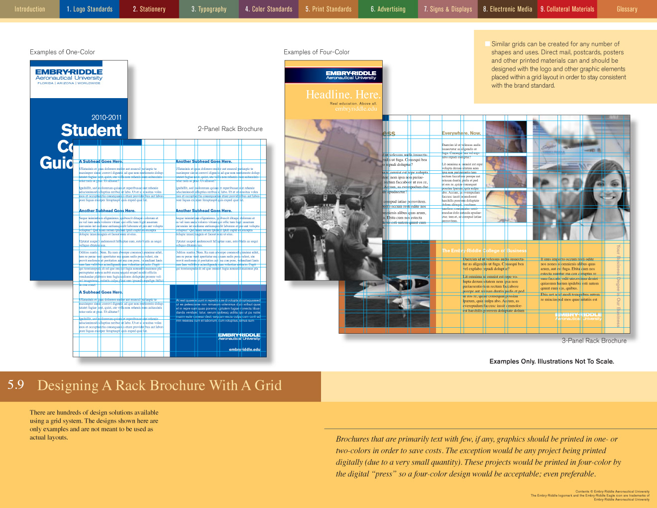
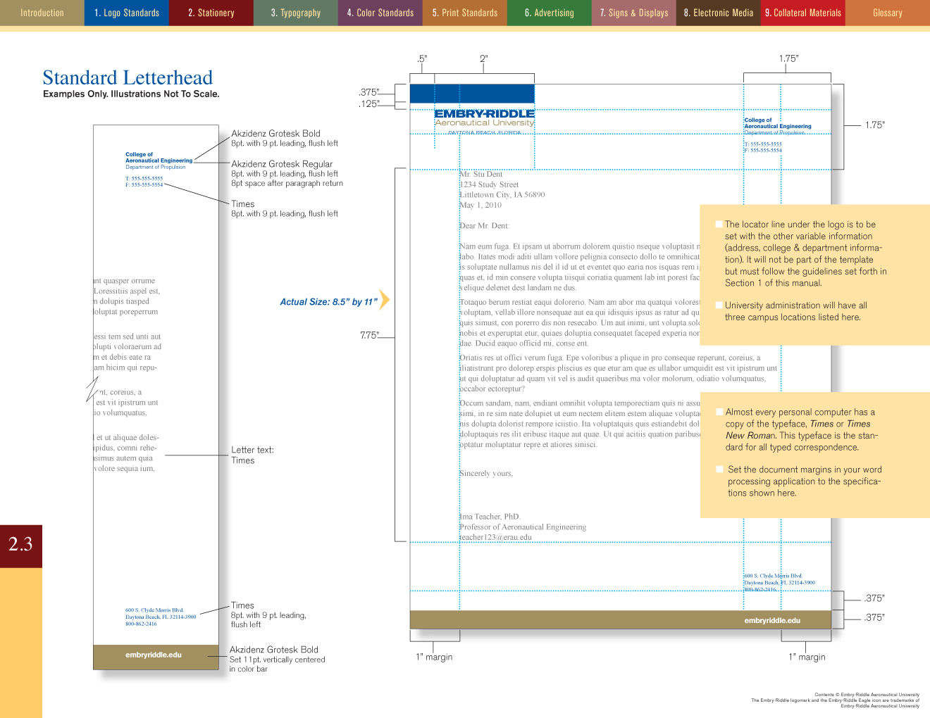
A modular grid system was designed for all print material. There is a new brand standard for all of this material.
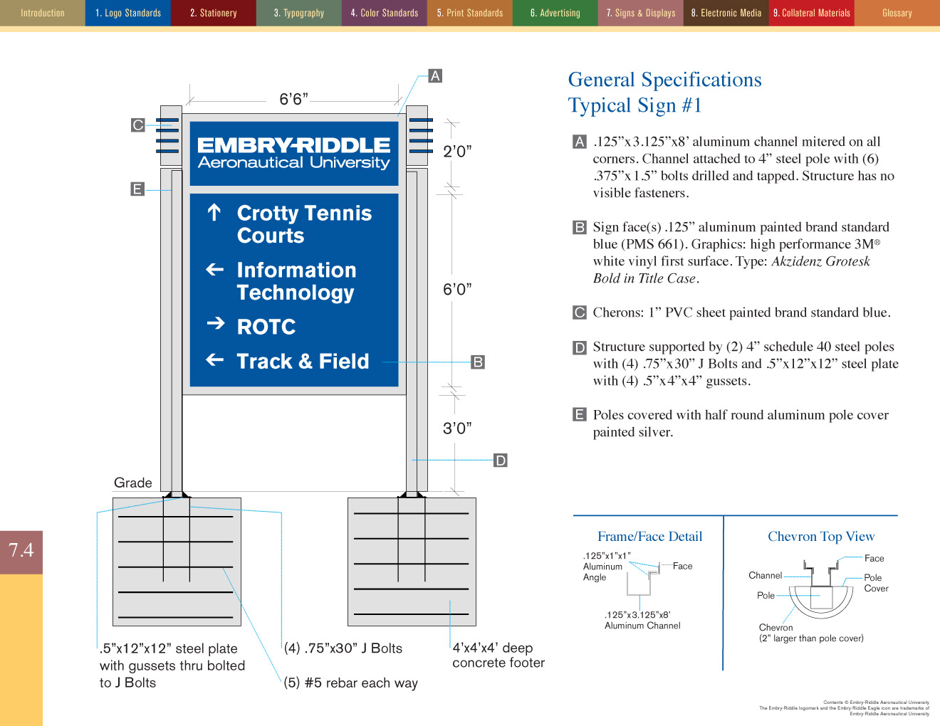
Signs and environmental graphics were designed in cooperation with the university's long time vendor.
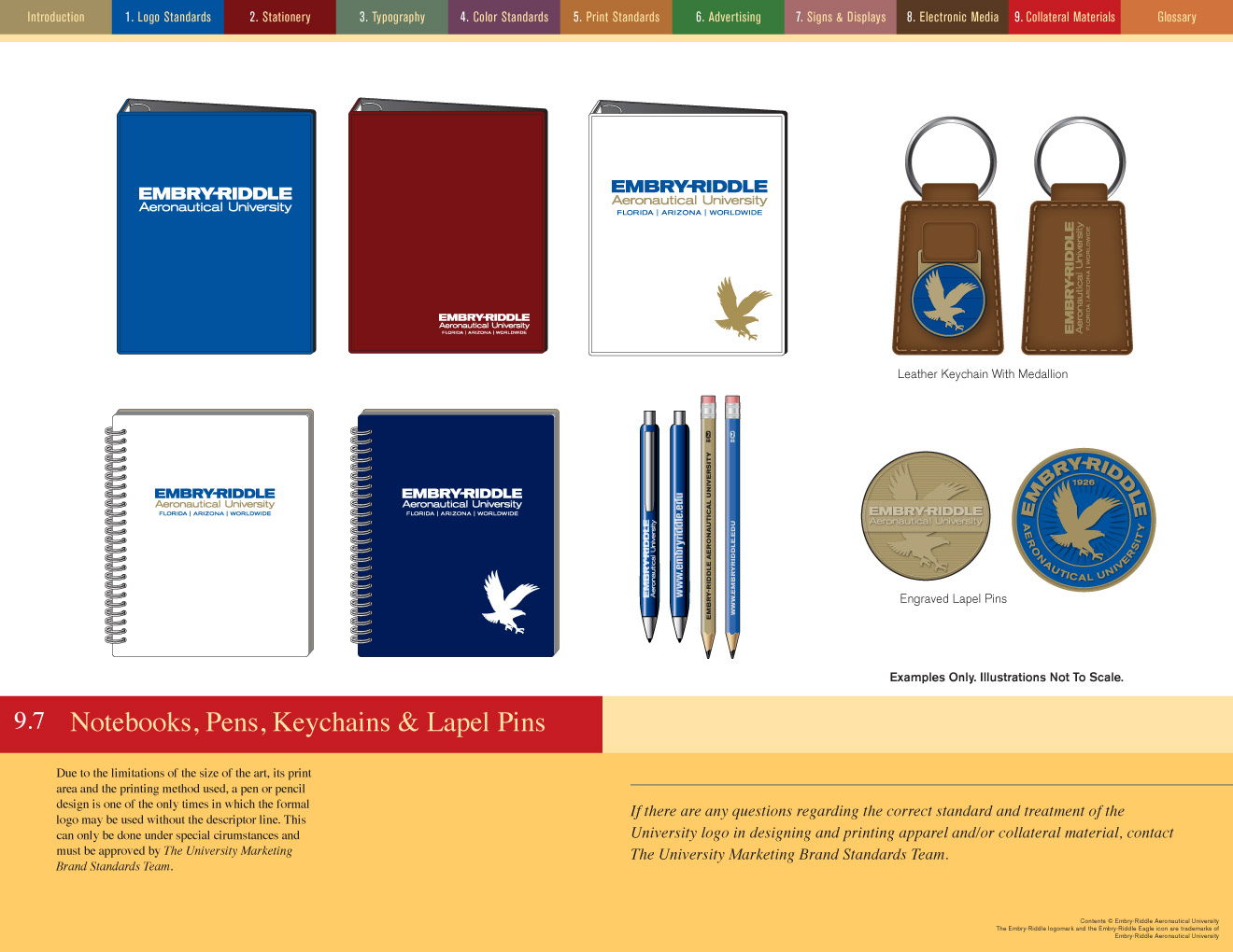
I ended up designing all kinds of things—some of which were never produced—but it was still a lot of fun.